Designing for disappointment
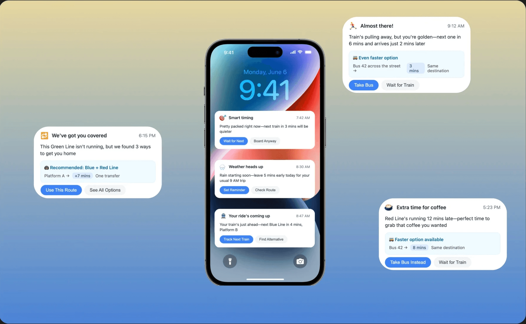
We’ve all been there: rushing to catch a train only to see it pull away, followed by a bland, unhelpful notification from your transit app. I explored how a behaviorally aware UX redesign of notifications could shift the experience from frustration to reassurance. For this case study, I focused on Transit App, a widely used real-time public transit tool, as the platform to apply and prototype this concept.
Role
UX/UI Designer
UX/UI Designer
Timeline
2 Weeks
2 Weeks
Skills
Figma, Adobe Suite
Figma, Adobe Suite
Tools
Behavioral UX, Research, UI Design
Behavioral UX, Research, UI Design
OVERVIEW
OVERVIEW
Challenge
Standard transit app notifications tend to:
Announce the missed train without helpful context
Offer no emotional intelligence or recovery options
Leave users feeling helpless or annoyed
Goal
Design a more helpful, empathetic notification experience during stressful situations
Solution
Redesigned the notification to provide real-time alternatives, a supportive tone, and immediate action options like checking alternate routes or setting alerts
Research Insights
From 15 daily commuters, ages 22-45:
87% experience anxiety when receiving delay notifications
Users want solutions, not just problem statements
Tone of communication directly affects stress levels
Behavioral Analysis:
Users make poor decisions when panicked
During stress, users want action
Supportive language reduces frustration faster
What's Needed:
Empathy First: Address emotional state before providing data and reduce anxiety through tone and design.
Shift From Disappointment to Next Action: reduce cognitive load by providing clear options at the right time and present the most important information first
Solution

Impact
Decreased app abandonment after missed-train events
-40%
Decreased app abandonment after missed-train events
-40%
Increased alternative route acceptance
+25%
Increased speed in rebooking
+30%
What I Learned
This project taught me the importance of balancing business needs with user experience. While EarnUp needed comprehensive user information, the key was finding the right moment to ask for it. By focusing on building trust first and collecting information progressively, we created a more human-centered experience that ultimately served both users and business goals.
Key Takeaway: Sometimes the most impactful design changes aren't about adding features, they're about removing friction and building trust at the right moments.