shiftleft

helping ShiftLeft redefine B2B SaaS marketing positioning and transformed their client from a dev shop into an AI innovation partner
Role:
Marketing, UX, Brand strategy Intern
Timeline:
May 2024 - August 2024
Tools:
Figma, Adobe Suite
Skills:
Prototyping, User Research, Visual Design
Team:
Anwesa Chatterjee & Deepti Illa
Used with permission. ©ShiftLeft, LLC. 2023
introduction

I joined ShiftLeft, a B2B SaaS marketing agency, as a Marketing, UX, Brand strategy Intern. I was tasked to position ShiftLeft as the go-to marketing partner for early-mid stage B2B SaaS startups while delivering strategic repositioning for their key client. I shaped clear narratives and crafted messaging that resonates with users.

CHALLENGE

ShiftLeft, a B2B SaaS marketing agency, was struggling to differentiate itself in a crowded market. Meanwhile, their key client, LenioLabs, a talented development agency, was stuck being perceived as "just another dev shop" when they actually had cutting-edge AI capabilities.

LETS SET SOME GOALS

  • Develop authentic, research-backed positioning.
  • Build pitch decks and web experiences that actually make people pay attention.
  • Launch a thought leadership campaign that means something beyond buzzwords.
process

SHIFTLEFT

I was first invited to ShiftLeft to help them stand out as the go-to-marketing partner for startups. To do this, I:

  • Collaborated with founders to develop the core value proposition: "Elevate marketers into growth catalysts"
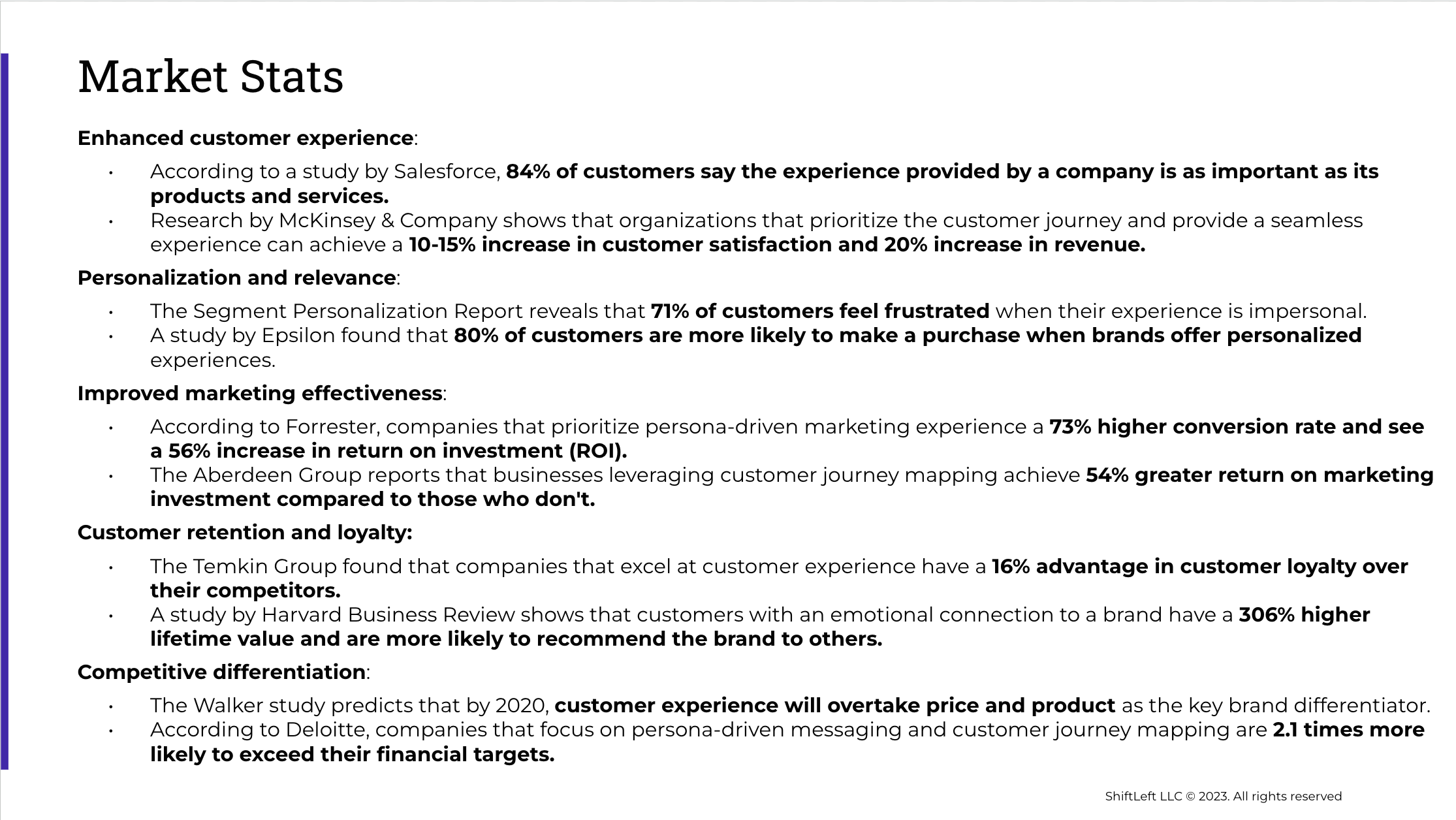
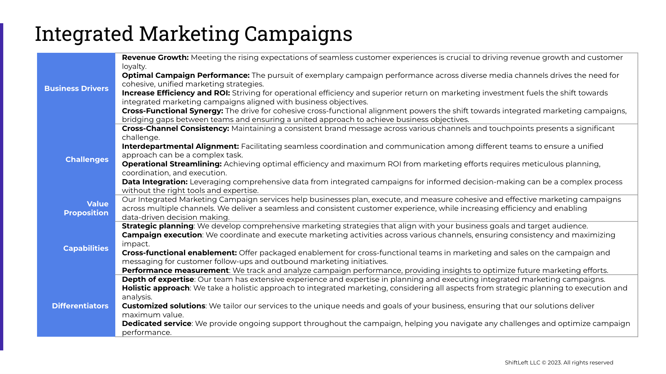
  • Created comprehensive messaging framework backed by market stats targeting CMOs, VPs of Demand Gen, and Growth Marketing leaders in early to mid level startups (see example screenshots of pitch decks below)
  • Helped refine the website with tighter UX + sharper messaging

LENIOLABS

We were then tasked to help ShiftLeft's clien LenioLabs transition from being perceived as a traditional software development shop to becoming an AI innovation partner. We did this by:

  • Researching human, insight-backed messaging and customer personas. (insert interview summaries and user personas)
  • Identified key market drivers: talent shortage, need for rapid AI implementation, and demand for specialized AI skills
  • Created a messaging framework and campaign plan emphasizing LenioLabs' AI capabilities and proof points. (insert campaign marketing pillars)

     87% of commuters experience anxiety when receiving delay notifications. One
     participant said, "My heart drops every time I see a transit notification. I know
     it's never good news."


     Users want solutions, not just problem statements

     From 5 interviews over Google Meet: 

     Users felt intimidated by the amount of personal and financial data required
     upfront

     There was a lack of clear value proposition reinforcement during signup

     Behavioral Analysis:

     People make poor decisions when panicked

     During stress, users want immediate action options

     Supportive language reduces frustration faster than a neutral tone


     From usability tests on the existing website:

     There were too many form fields, which created decision paralysis

     Users couldn't see progress or end goal

     From 15 user surveys: 

     Users hesitated to provide sensitive financial information without understanding
     the full benefit

     There was no clear security messaging or credentials displayed
Using the pain points I gathered from my interviews, surveys, and usability tests, I created personas to represent some of our users and their goals, frustrations, and decision-making styles. To put our experience in context, I also conducted a competitive analysis of similar fintech companies, breaking down how they structure their enrollment flows to reduce friction. This gave me a clear picture of what not to do, as well as a few smart ideas worth adapting.

     The Psychology of Transit Stress:

     Empathy First: Address the emotional state before delivering data. A stressed      commuter needs reassurance before they need train times.

     Shift From Problem to Solution: Instead of focusing on what went wrong, immediately
     redirect attention to what can be done about it.

     Cognitive Load Matters: When people are stressed and in a hurry,
     decision-making becomes harder. We need to simplify choices and highlight the best
     options.
summary

With the design complete, I moved on to development using Webflow. This allowed us to create a responsive website that looks and functions great on all devices. We also integrated various features such as a contact form and live chat to make it easy for users to connect with the company.

Final

The end result was a website that was easy to navigate and provided a great user experience. The website received positive feedback from users and the company saw an increase in user engagement and conversions.

In conclusion, with a little bit of research, wireframing, design, and Webflow development magic, XYZ's website went from being a maze to a smooth experience for users.


     Reduce Friction: Ask only for what’s necessary, when it matters most.

     Build Trust: Use friendly language, clear value props, and reassuring microcopy.

     Guide with Empathy: Design with the user’s pain-points and motivations in mind.

     Reframe negative moments with actionable options

     Use microcopy to shift emotional tone

     Provide clear choices to reduce cognitive load

the impact
behind the solution
  
     Decreased app abandonment after missed-train events by 40%

     
Increased alternative route acceptance by 25%


     Faster rebooking and route-switching by 30%
the impact
  
     Decreased drop-off rate by 20%
Why These Numbers Make Sense

Reduced Cognitive Load
When people don't have to think about next steps, they act faster.

Emotional Support = Engagement
Users are more likely to stay with an app that makes them feel supported rather than stressed.

Clear CTAs Drive Action
When the best option is obvious, people take it.ide of a div block.

     Increased satisfaction scores by 15%

     Increased completion time by 35%


what i learned

other projects

see all

earnup

redesigning the enrollment flow for a fintech startup helping users manage and pay off debt

designing for disappointment

designing empathetic notifications for the Transit app